How to use Heroicons in your React app

Senior Full-Stack Developer with over 20 years of experience building web applications for startups, government, and higher education.
Heroicons are a great resource, this is how to use them in your React app.
Choose an Icon any Icon
First lets grab an icon from the Heroicons website. Simply search for an icon and click the "Copy JSX" button.
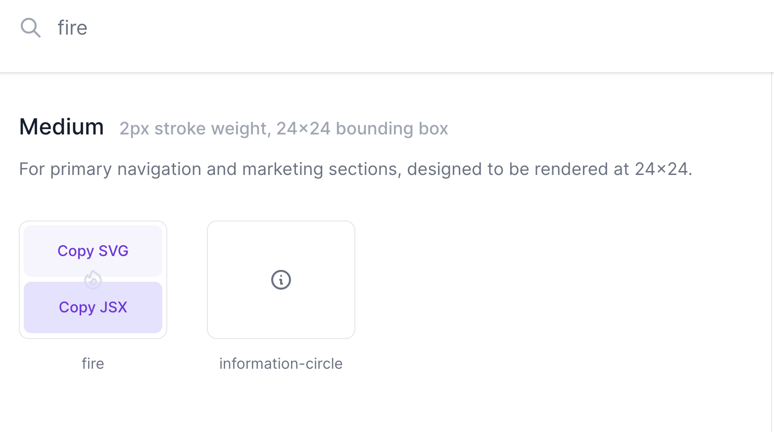
This will copy the icon to your clipboard ready to paste into your React project.
<svg xmlns="http://www.w3.org/2000/svg" fill="none" viewBox="0 0 24 24" stroke="currentColor">
  <path strokeLinecap="round" strokeLinejoin="round" strokeWidth={2} d="M17.657 18.657A8 8 0 016.343 7.343S7 9 9 10c0-2 .5-5 2.986-7C14 5 16.09 5.777 17.656 7.343A7.975 7.975 0 0120 13a7.975 7.975 0 01-2.343 5.657z" />
  <path strokeLinecap="round" strokeLinejoin="round" strokeWidth={2} d="M9.879 16.121A3 3 0 1012.015 11L11 14H9c0 .768.293 1.536.879 2.121z" />
</svg>
Create the React component
We're using Create React App which automatically recognises the JSX SVG component we copied from the Heroicons website.
Create a new component file called Icons.tsx that we'll use to hold all our icons. Inside this file create a new component with the same name as the icon from the Heroicons.
Keeping the same name helps if you need to go back to the site and update the icon version later.
filename: Icons.tsx
import React from 'react';

export const IconFire = () => (
  <svg
    xmlns="http://www.w3.org/2000/svg"
    fill="none"
    viewBox="0 0 24 24"
    stroke="currentColor"
    className="w-4"
  >
    <path
      strokeLinecap="round"
      strokeLinejoin="round"
      strokeWidth={2}
      d="M17.657 18.657A8 8 0 016.343 7.343S7 9 9 10c0-2 .5-5 2.986-7C14 5 16.09 5.777 17.656 7.343A7.975 7.975 0 0120 13a7.975 7.975 0 01-2.343 5.657z"
    />
    <path
      strokeLinecap="round"
      strokeLinejoin="round"
      strokeWidth={2}
      d="M9.879 16.121A3 3 0 1012.015 11L11 14H9c0 .768.293 1.536.879 2.121z"
    />
  </svg>
);
Styling with Tailwind CSS
We need to add a bit of styling to the SVG to make it render correctly. Here we're using Tailwind CSS to set the width of the icon.
filename: Icons.tsx
  <svg
    ...
    className="w-4"
    ...
  >
Use your new Icon
We can now import our new icon anywhere its needed within our app:
filename: App.tsx
import { IconFire } from 'Icons';
...
  <IconFire />
...
Beautifully simple, enjoy 😀